Foo Fighters
Simplifying the band's web presenceDepicting a twenty-five year career
The Foo Fighters have grown to become an institution over their twenty-five year career. They were looking for a website that could summarise the journey they’ve been on over this time, and would show the many logos they’ve used over the years.
Agency: Modern English
Visit site
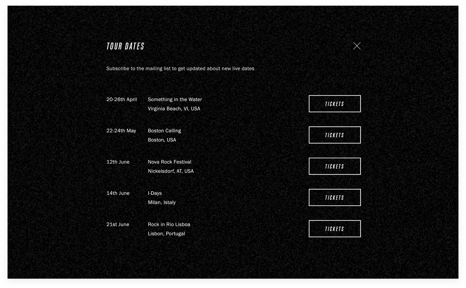
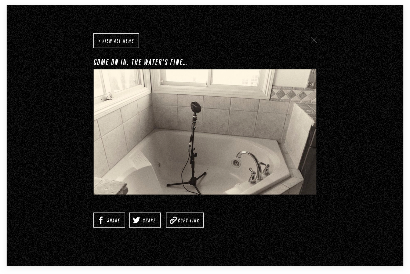
Anticipation and cryptic-ness
Interactions referencing television static hint at a sense of anticipation. The fonts used are also a subtle nod to the type used on their 1997 breakthrough album ‘The Color and The Shape’.